What is achromatopsia?
Achromatopsia means without color. Most achromats are rod monochromats. Complete rod monochromats have no color vision. While incomplete rod monochromats may have small traces of specific colors when the light and glare are 'just right.'
While we often describe the vision of complete achromats as seeing black and white or gray, the range of tones of gray when light is controlled can be quite stunning, like a fine black and white photograph.

Achromatopsia gives a large range of tones, therefore no issue to distinguish elements if the shade and contrast is present.
However with lighter shades such as yellow, the color contrast becomes a problem for reading and distinguish what is on a picture. Are you able to read this without underlining the text? :)

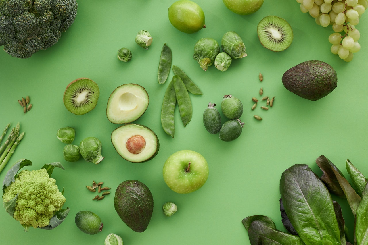
Similarly to the green and blue captions, if the shade and contrast is sufficient, reading and identifying elements on pictures is easy.
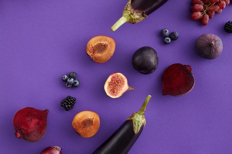
Similarly to the green and purple captions, if the shade and contrast is sufficient, reading and identifying elements on pictures is easy.

Color recap with achromatopsia
Colors & Design
Emulating real life examples with colorblindness
Communicating message with colours
One common mistake is to assume colors can do the job for actions such as showing valid or invalid inputs.
In most color blind types, the green and red outlines are either confused together, or not matching any code color reminding of a valid or invalid element (grey, yellows. etc.)
Learn more: Avoid communicating a message on the basis of colour
Links and colors
Using color to only differenciate a link from the text is inaccessible for colorblind users.
In the following example, the chapter 1 and last paragraph are links, without underline. It's difficult, if not impossible to see the difference between the text and the links available.
Learn more: Render links accessible
The European languages are members of the same family. Their separate existence is a myth. For science, music, sport, etc, Europe uses the same vocabulary. The languages only differ in their grammar, their pronunciation and their most common words.
Color contrast
Welcome to my portfolio!
I'm a content creator and translator from English to German and German to English.
Color contrast is sometimes set aside, in favor of a subtle color theme. If the background and text colors have a low contrast, they are illegible.
In this example, deuteranopian and protanopian users are the most affected with this choice of colors. They might not even see there is content on the page.
Learn more: Top color contrast checkers, Color and contrast with Material.io
Color pickers
Color pickers sometimes use the original color as caption. This type of selection is only accessible for non colorblind users. Users with protanopia, deuternopia, tritanopia and achromatopsia are unable to identify the original colors shown.
With protanopia and deuteranopia, reds, greens, yellows, purple are impossible to identify. Tritan users will confuse pinks, yellows, purple, also, greens and blues are altered and difficult to identify.
Learn more: Designing eCommerce for colorblind users

Unisex t-shirt Lightbulb - 35 EUR
Choose a color:
Pie charts and infographics
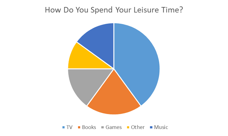
Pie charts and graphics are also easily inaccessible, due to the colors, again, being the only source of information. Different tones of blue and yellow will be seen as very similar with protanopia, deuteranopia, tritanopia. Achromatopsia can even show colors in the same shade of grey, which makes the pie chart impossible to read.
Learn more: How to render diagrams and infographics accessible
Resources
eBooks
- Color Accessibility Workflows, by Geri Coady
- Inclusive Design Patterns, by Heydon Pickering
Definitions
- Types of Color Blindness, by National Eye Institute (USA)
- Color simulation on colorblindness, by Sumant Pattanaik
- Colorblindness and Achromatopsia, by Low Vision Centers of Indiana
- What is colorblindness?, by Colorblind Awareness (NGO)
- Color blindness, Wikipedia
- Deuteranopia, Protanopia and Tritanopia, by Colblindor
- Colors on the Web, Color Contrast, by COTW
- Types of Colorblindness, by Enchroma
Best practices and recommendations
- Colorblindness in User Interfaces, by Ivan Tuchkov
- Colorblind Accessibility on the Web – Fail and Success Cases, by Hampus Sethfors
- Designing eCommerce for colourblind users, by CanvasFlip
- Color Contrast: For the Sake of Aesthetic and Accessibility, by Daniella Alscher
- Improving The Color Accessibility For Color-Blind Users, by Adam Silver
- Best color contrast checkers and analyzers, by Hampus Sethfors
- Accessible Color Swatch, by Brian Suda
- Color Safe, by Unknown
- Accessible SVGs in High Contrast Mode, by Eric Bailey
- How to make figures and presentations that are friendly to color blind people, by Masataka Okabe & Kei Ito
Extensions and applications
- Color Blindness Correction, Augmented Reality Application by NGHS
- Colorblind Emulator, Chrome extension by Agathe Badia
- Color advice for Cartography, by Cynthia Brewer, Mark Harrower and The Pennsylvania State University
- Color Oracle, by Bernie Jenny and Nathaniel Vaughn Kelso
- Wave Browser Extensions, Chrome, Firefox, Microsoft Edge, by WebAIM